Create Data Visualization
Contents
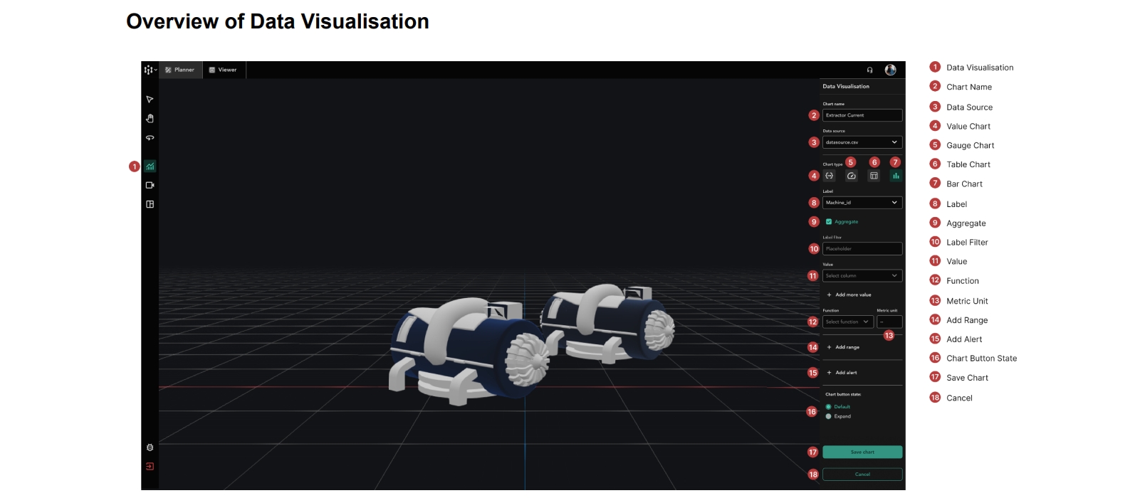
Overview of Data Visualisation Controls
There are 4 types of charts you can use to display your data:
Value Charts
Gauge Charts
Table Charts
Bar Charts
The creation process for value charts and gauge charts are similar, while the creation process for table and bar charts are similar.
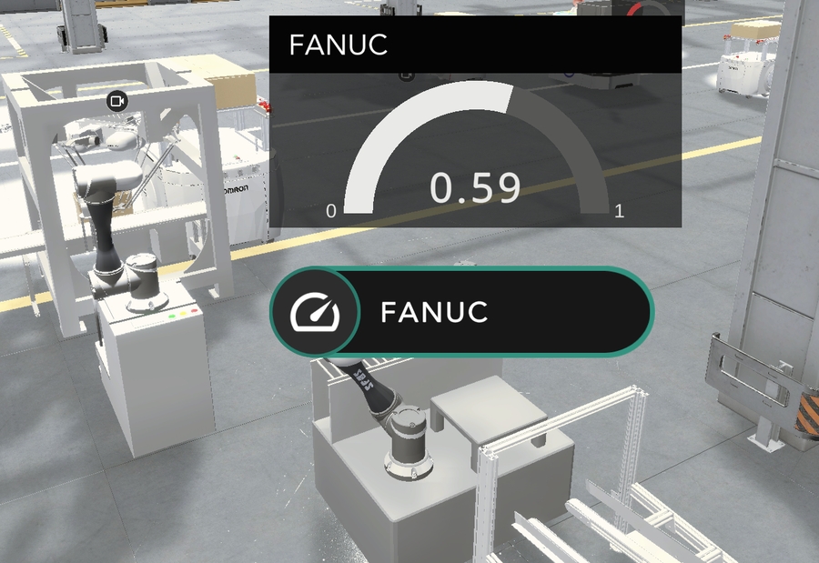
How to create a Gauge Chart
Ensure that you are in
Plannermode
To add a new data visualisation, ensure that you have no objects currently selected, and click
Data Visualisation
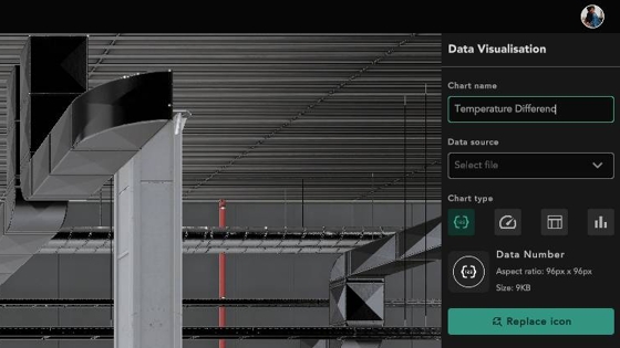
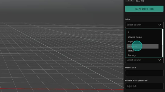
Give your data visualisation a label
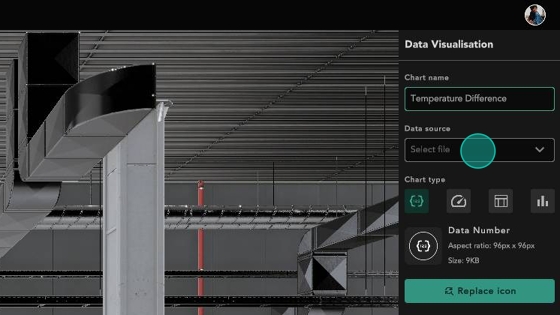
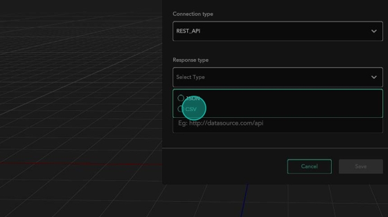
Choose the data source that you wish to display in the live view. See Add Data Source if you have no data sources in your list yet
Choose the data source that you wish to display in the live view
For this example, we will be adding a gauge chart
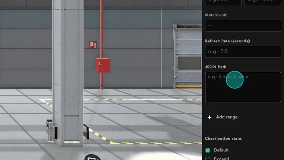
Input the query to select the data you want from your data source
If the data source is a REST API connection and returns JSON as its response, use a JSON path to select the data you want from your API endpoint. To learn how to choose the JSON path, see Specifying a JSON Path
If the data source is a SQL connection, use a SQL query to select the data you want from the database.
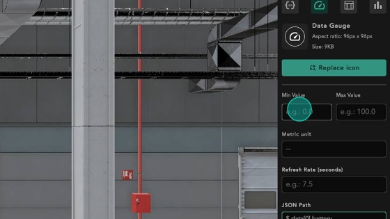
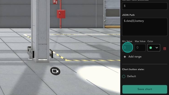
Set the minimum and maximum values that this gauge can take
Set how frequently you want your API endpoint to be called
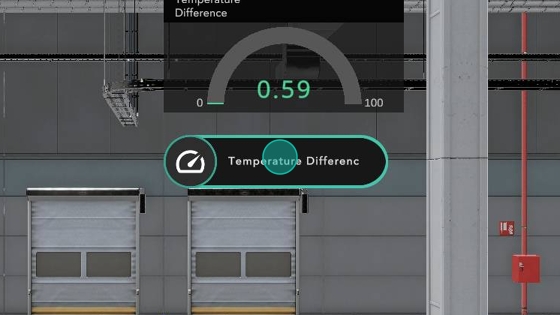
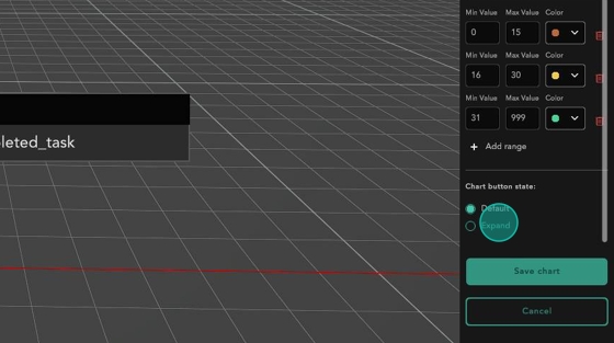
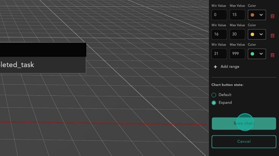
Choose whether the chart is folded into its label by default, or is expanded, displaying its value
stays closed, click to expand
stays open, click to hide
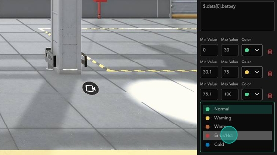
To colour the values when they cross your thresholds, you can add a range to colour the chart
Set the minimum and maximum value of the range and its corresponding colour
These are the colours available
Save your chart once you have finished configuring it
Congratulations, your chart successfully appears in the environment.
How to create a Table Chart
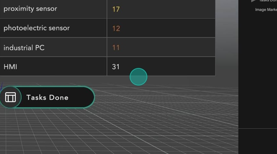
For this example, we will create a table that shows us the total number of tasks that each type of robot in our factory completes.
Firstly, follow step 1-4 of How to create a Gauge Chart. Note that the data source you use must be a CSV data source. To learn more, see Add Data Source
Choose the
Labelof the items you wish to see. It will be the first column. For this example, I want to see the tasks done for each category of robot.
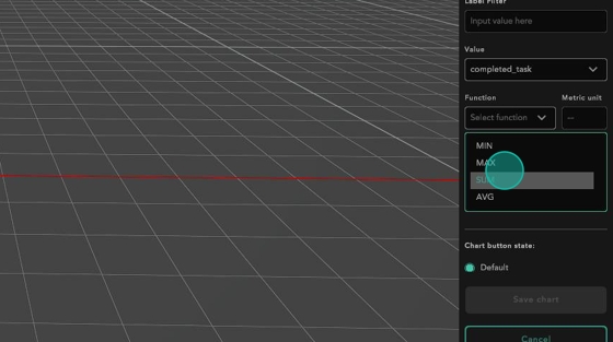
To make it add the number of tasks for each type of robot, we will use the
Aggregatefeature, and scroll down toSUMthe number of tasks for robots of each category
Note: you can use the Aggregate feature to group or combine data together. It is useful as it can summarise a large dataset, enable the identification of trends and patterns, enable comparisons, and support decision-making. The Function lets you decide how you wish to combine the data.
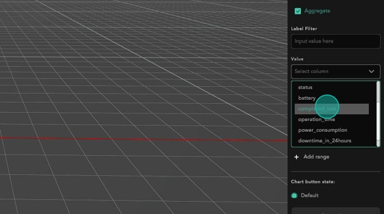
Additionally, you may sift out relevant data from a large dataset using the Label Filter.
Afterwards, pick the
Valuethat you wish to monitor. I will be looking at the number of tasks done by the robots.
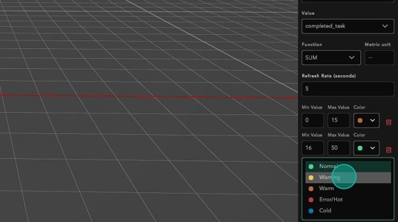
Set colour ranges for each value to warn you when you want to notice values above certain thresholds
To see the table expanded in viewer mode, select the expanded option. Otherwise, it will be folded into an icon by default.
Save your chart once you have finished configuring it
Congratulations, you have successfully created a table chart
Last updated